Payment page components
- 18 Dec 2023
- 4 Minutes to read
- Print
- DarkLight
Payment page components
- Updated on 18 Dec 2023
- 4 Minutes to read
- Print
- DarkLight
Article summary
Did you find this summary helpful?
Thank you for your feedback
Place the payment components on your payment page where you want the controls to appear. When the payment page is loaded, these components will be replaced with the controls for securely collecting payment details.
The integrator should determine which components are needed based on the payment methods they wish to support.
Apple Pay button
The Apple Pay button enables your payment page to display the payment method for selection. You should check whether Apple Pay is supported by the device before displaying the button.
To display the Apple Pay button after checking whether the method is supported, add the following HTML to the body of your payment page:
if (window.applePaySession)
  {
     //<div id="pay360-apple-pay-button"></div>
   }
When your payment page is loaded with Direct Checkout integrated, and the device supports Apple Pay, the Apple Pay button will be displayed: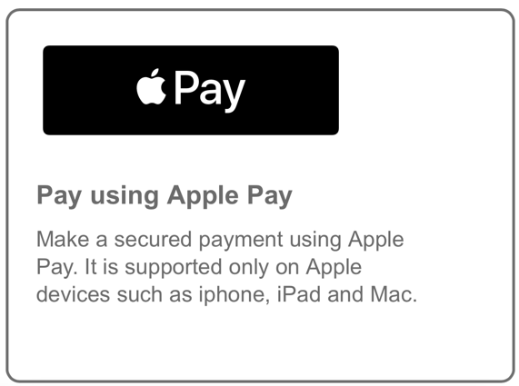
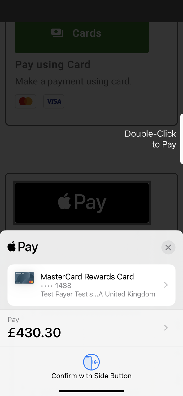
Once the payer clicks on the button, an Apple Pay payment sheet will be displayed:
Google Pay button
The Google Pay button enables your payment page to display the payment method for selection. To display the Google Pay button add the following HTML to the body of your payment page:
<div id="pay360-google-pay-button"></div>When the payment page is loaded with Direct Checkout integrated, and the device supports Google Pay, the Google Pay button will be displayed:
.png "Google Pay button (plain).png")
The style of the Google Pay button may be controlled via the Config object.
Once the payer clicks on the button, the Google Pay payment sheet will open and will ask the payer to complete the payment by selecting the available cards in the wallet. They will be prompted to login to their Google account if they are not signed in.
Pay by Bank Account (Open Banking) button
The Pay by Bank Account button enables your payment page to display the payment method for selection.
To display the Pay by Bank Account button, add the following HTML to the body of the payment page:
<div id="pay360-open-banking-button"></div>Upon successful integration the payer will see the payment option and will be able to select “Pay by Bank Account.” Once the payer clicks on the button, the user will be redirected to the NuaPay payment page. Refer to the Pay by Bank Account payment journey.
Card components
These components should be configured to capture and process card transactions:
• Card details component
• Billing address and email component (conditional)
• Card Submit component.
Card details component
The card payment component enables your payment page to embed a group of controls that enables the capture of card payment data.
To embed a card payment component, add the following HTML onto the body of your payment page.
<div id="pay360-cardholder-data"></div> When your payment page is loaded with Direct Checkout integrated, this component will display a group of secure card input controls.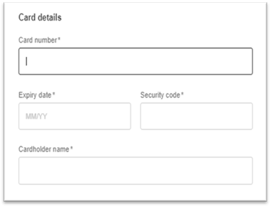
Cardholder details component (conditional)
The cardholder details component enables your payment page to embed a group of controls that enables the capture cardholder details.
This is a conditional component based on your requirements.
If your integration is not supplying billing details in the payment intent, then this component is required since some of the address fields are currently mandatory to perform 3D Secure authentication. Please note that the mandatory fields may change in future, in line with card scheme and card issuer requirements
If your integration is supplying billing details in the payment intent, then this component is optional. If embedded and values are supplied, then they will overwrite the data from the payment intent.
We will require a billing email to provide an Access PaySuite email receipt, which can be sent in the payment intent, or collected/amended via this component.
There are various ways to embed the cardholder details component.
Display a checkbox to expand and show the billing address and email components:
<div  id="pay360-billingAddress-checkbox"></div>
    <div  id="pay360-billingAddress-container">
    <div  id="pay360-billingAddress-title"></div>
    <div  id="pay360-billingAddress-line1"></div>
    <div  id="pay360-billingAddress-line2"></div>
    <div  id="pay360-billingAddress-line3"></div>
    <div  id="pay360-billingAddress-line4"></div>
    <div  id="pay360-billingAddress-city"></div>
    <div  id="pay360-billingAddress-county"></div>
    <div  id="pay360-billingAddress-country"></div>
    <div  id="pay360-billingAddress-postcode"></div>
    <div  id="pay360-billingEmail"></div>
    </div>
Always display the mandatory billing address components:
<div  id="pay360-billingAddress-line1"></div>
    <div  id="pay360-billingAddress-line2"></div>
    <div  id="pay360-billingAddress-city"></div>
    <div  id="pay360-billingAddress-county"></div>
    <div  id="pay360-billingAddress-country"></div>
    <div id="pay360-billingAddress-postcode"></div>
    <div  id="pay360-billingEmail"></div>
Always display all billing address components (mandatory and optional):
<div  id="pay360-billingAddress-line1"></div>
    <div  id="pay360-billingAddress-line2"></div>
    <div id="pay360-billingAddress-line3"></div>
    <div  id="pay360-billingAddress-line4"></div>
    <div  id="pay360-billingAddress-city"></div>
    <div  id="pay360-billingAddress-county"></div>
    <div  id="pay360-billingAddress-country"></div>
    <div  id="pay360-billingAddress-postcode"></div>
    <div  id="pay360-billingEmail"></div>
When your payment page is loaded with Direct Checkout having been integrated, this component will display a group of billing address input controls. An example of the output is below.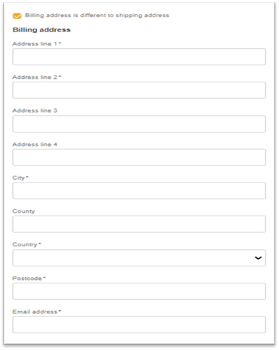
Card submit component
The submit component will enable you to post data collected from the secure payment controls and submit the data to the Evolve Payment Service. This is only required for card payment.
To embed a submit component, add the following HTML onto the body of your payment page.
<div id="pay360-submit"></div> Error components
The error component enables your payment page to embed an error message that is returned from Direct Checkout.
To embed an error component, add the following HTML into the body of your payment page:
Apple Pay
<div id="pay360-apple-pay-errors"></div>Google Pay
<div id="pay360-google-pay-errors"></div>Pay by Bank Account (Open Banking)
<div id="pay360-open-banking-errors"></div>Card
<div id="pay360-card-pay-errors"></div> Global Error Handling
The Global error component enables your payment page to embed an error message that is returned from Direct Checkout. You should add CSS to hide this field in the payment page, so that these particular errors are not visible to the payer. To embed the error component, add the following HTML onto the body of your payment page:
<div id="pay360-errors"></div> The system may provide the following types of errors:
Integration errors
These messages will be displayed with an error icon inside the “pay360-integration-error” container under “pay360-errors” component. Until these items are addressed, the submit button will be disabled and transactions cannot be processed.
Runtime errors
These are the errors that could occur during a transaction.
Was this article helpful?